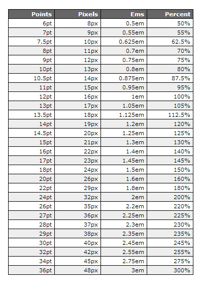
Have you ever struggled to achieve the perfect font size for your design projects? Choosing the right text dimensions can be a critical factor in the readability and overall impact of any visual communication, from websites and presentations to printed documents and posters. This comprehensive guide explores the intricacies of point size (pt), the standard unit of measurement for type, and equips you with the knowledge to make informed decisions about font sizing.
Understanding point size is essential for effective typographic control. It dictates how large or small characters appear, directly influencing legibility and aesthetic appeal. Choosing an appropriate point size ensures that your text is comfortable to read and contributes to the overall visual harmony of your design. Whether you're a seasoned designer or a beginner, mastering point size is a fundamental skill for achieving professional-looking results.
Point size, abbreviated as "pt," represents the vertical measurement of a typeface. One point is approximately 1/72 of an inch. This traditional unit of measurement has been used in printing and typography for centuries. While digital design tools often display point size numerically, understanding its historical context can provide valuable insights into its significance and application in modern design.
The origin of the point system can be traced back to the early days of printing. While several variations existed, the Didot point system, developed in France in the late 18th century, and the American point system, based on the pica, became widely adopted. Today, the desktop publishing point (DTP point), equivalent to 1/72 of an inch, has become the standard in digital typography.
The main issue related to point size is its potential inconsistency across different platforms and devices. Screen resolutions and rendering engines can influence how point size translates to actual pixel size on a screen. This can lead to variations in how text appears, making cross-platform compatibility a challenge. However, understanding how point size interacts with different output mediums can help mitigate these inconsistencies.
A larger point size results in bigger characters, while a smaller point size produces smaller characters. For example, 12pt font is generally considered a standard size for body text in printed documents, while larger point sizes, such as 18pt or 24pt, are commonly used for headings and titles.
Benefit 1: Enhanced Readability: Choosing an appropriate point size improves the readability of text, making it easier for readers to comprehend the content. For instance, using a larger point size for body text on a website designed for older users can significantly enhance their reading experience.
Benefit 2: Improved Aesthetics: Point size plays a crucial role in the overall visual appeal of a design. Carefully selecting point sizes for different text elements, such as headings, subheadings, and body text, creates visual hierarchy and balance, making the design more engaging and aesthetically pleasing. Think of a magazine layout where varying point sizes are used to create an attractive and organized visual structure.
Benefit 3: Effective Communication: The right point size helps convey the intended message effectively. Using a larger point size for important information emphasizes its significance, while smaller point sizes can be used for less critical details. For example, a warning message displayed in a larger point size immediately catches the reader's attention.
Advantages and Disadvantages of Using Point Size
| Advantages | Disadvantages |
|---|---|
| Standard unit of measurement | Inconsistency across platforms |
| Precise control over font size | Can be challenging for beginners |
| Widely supported by design software | Requires understanding of resolution and DPI |
Best Practice 1: Consider the target audience. Older readers may benefit from larger point sizes.
Best Practice 2: Choose appropriate point sizes for different text elements.
Best Practice 3: Test different point sizes on various devices.
Best Practice 4: Maintain consistency in point size usage throughout a design.
Best Practice 5: Pay attention to line height and letter spacing in conjunction with point size.
Frequently Asked Question 1: What is the difference between pt and px?
Answer: Pt is a fixed unit based on physical measurement, while px is relative to screen resolution.
In conclusion, mastering point size is crucial for effective typographic control and achieving professional design results. By understanding the history, benefits, and best practices associated with point size, you can create visually appealing and highly readable text for any project. Remember to consider your target audience, choose appropriate point sizes for different text elements, and test your designs on various devices to ensure optimal readability and visual impact. By incorporating these principles into your design workflow, you can elevate your typography skills and communicate your message effectively. Explore the resources available online and experiment with different point sizes to develop a keen eye for typographic detail. The effective use of point size is a fundamental skill that will enhance your design capabilities and empower you to create truly impactful visual communications.
Useful Font Size Conversion Chart Pt Px Em Percentage - Trees By Bike
Never worry about font sizes again Just use these - Trees By Bike
pt in font size - Trees By Bike
Font Point Size Chart - Trees By Bike
Typography Rules You Should Know as a Designer - Trees By Bike
Text Font Size Chart - Trees By Bike
Fonts point size and line spacing - Trees By Bike
pt in font size - Trees By Bike
Font sizes font size conversion - Trees By Bike
Font Point Size To Inches Chart - Trees By Bike
Text Font Size Chart - Trees By Bike
Printable Font Size Chart - Trees By Bike
Font Type Size Chart - Trees By Bike
Font Point Size To Inches Chart - Trees By Bike
Font Point Size Chart Pdf - Trees By Bike


