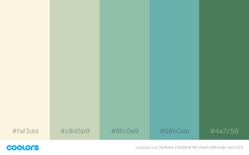
There's an undeniable magic to certain color combinations. They catch your eye, evoke a feeling, and linger in your memory long after you've looked away. It's this inherent power of color that artists, designers, and even everyday individuals have been harnessing for centuries. Whether it's the vibrant hues of a bustling marketplace in Marrakech or the serene palette of a misty morning in the Scottish Highlands, aesthetically pleasing color combinations have a unique ability to transform the ordinary into the extraordinary.
But what exactly makes a color combination aesthetically pleasing? Is it purely subjective, a matter of personal taste, or are there underlying principles at play? The answer, like most things in life, is a nuanced blend of both. While individual preferences undoubtedly play a role, there's a fascinating interplay of history, culture, psychology, and even science that informs our perception of beauty in color.
Throughout history, civilizations have attributed symbolic meanings to colors, influencing their use in art, fashion, and everyday life. From the regal purple of Roman emperors to the calming blue often associated with peace and tranquility, colors carry cultural and historical weight, shaping our subconscious reactions to them.
The study of color theory, a discipline dating back centuries, delves into the relationships between colors and their visual impact. Concepts like complementary colors (those opposite each other on the color wheel) and analogous colors (those adjacent to each other) provide a framework for understanding how different hues interact, creating harmony or contrast.
Beyond the technical aspects, however, lies the undeniable emotional response that color evokes. A burst of sunshine yellow can instantly uplift the mood, while a deep, rich burgundy might evoke feelings of sophistication and luxury. It's this powerful connection between color and emotion that makes the pursuit of aesthetically pleasing color combinations so endlessly fascinating.
Now, let's explore some of the ways these principles translate into real-world application. Imagine walking down a street and noticing someone with an effortlessly chic outfit. Perhaps it's the unexpected pairing of a deep forest green coat with a pop of mustard yellow in their scarf, or the way a soft lavender blouse complements their warm skin tone. These seemingly effortless looks are often the result of a keen eye for color and an understanding of what works well together.
Similarly, consider the impact of color in interior design. A well-chosen palette can transform a space from cold and uninviting to warm and welcoming. The soothing effect of earthy greens and blues in a bedroom, the energizing vibe of a sunny yellow kitchen, or the dramatic flair of a charcoal grey dining room with pops of jewel tones — each color choice contributes to the overall ambiance and feel of a space.
Ultimately, the ability to recognize and utilize aesthetically pleasing color combinations is a skill that can enhance various aspects of life. Whether you're choosing an outfit, decorating your home, or simply appreciating the beauty of the world around you, developing an eye for color opens up a world of creative possibilities.
aesthetically pleasing color combination - Trees By Bike
10 Aesthetically Pleasing Color Combinations for Your Bedroom - Trees By Bike
A colour palette is a combination of colours that work together to - Trees By Bike
Kindly do securely ensure on of close are and electronics travel usage - Trees By Bike
30 Aesthetically Pleasing Color Combinations - Trees By Bike
aesthetically pleasing color combination - Trees By Bike
Choosing the right color combination is a crucial aspect of creating an - Trees By Bike
aesthetically pleasing color combination - Trees By Bike
Aesthetic Tones Color Palette - Trees By Bike
aesthetically pleasing color combination - Trees By Bike
@beereckless Aesthetic Color Palettes - Trees By Bike
Canva Colour Palette with Hex Codes - Trees By Bike
aesthetically pleasing color combination - Trees By Bike
34 Beautiful Color Palettes For Your Next Design Project - Trees By Bike
100 brilliant color combinations and how to apply them to your designs - Trees By Bike


