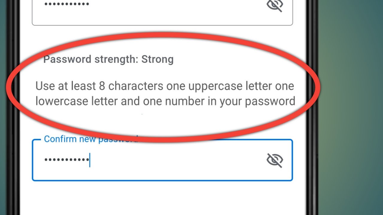
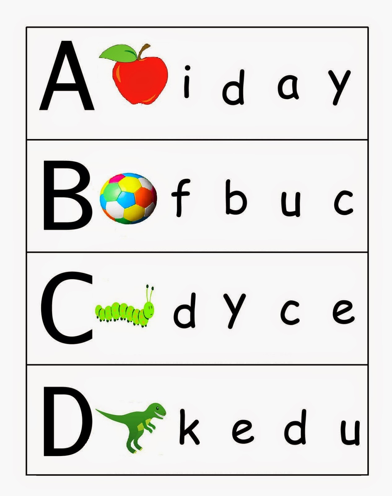
Have you ever stopped to think about the seemingly insignificant details of our written language? While we often take them for granted, the small differences between characters can drastically alter meaning and clarity. Consider, for a moment, the humble distinction between uppercase and lowercase letters. These two variations, often used interchangeably in casual communication, hold a surprising amount of power in the written word.
At first glance, the difference might appear trivial. One is merely a larger version of the other, right? However, delve a little deeper, and you'll uncover a fascinating history and nuanced usage that highlights their essential role in written communication. These subtle shifts in size contribute significantly to readability, grammar, and even artistic expression.
The history of uppercase and lowercase letters can be traced back to ancient Roman inscriptions. The formal, chiseled letters we associate with uppercase originated as capitalis monumentalis, primarily used for important monuments and official documents. Over time, a more casual, flowing script known as cursive minuscule emerged, eventually evolving into the lowercase letters we know today. This cursive style, favored for its speed and convenience, became the foundation for everyday writing.
The development and adoption of these two distinct letterforms marked a pivotal point in the evolution of written language. It allowed for a visual hierarchy within text, making it easier to read and understand. Uppercase letters, with their bold presence, were employed to signal the beginning of sentences, denote proper nouns, and emphasize important words. In contrast, lowercase letters, smaller and more numerous, formed the bulk of written text, ensuring a smoother flow and improved readability.
Despite their seemingly simple nature, uppercase and lowercase letters play a critical role in ensuring clear and effective communication. Their consistent application helps to prevent misinterpretations, maintain grammatical accuracy, and enhance the overall readability of a text. Imagine reading a paragraph where all the letters are in uppercase – it would feel jarring, wouldn't it? Conversely, a paragraph entirely in lowercase lacks structure and appears informal, even careless.
Beyond their functional purpose, uppercase and lowercase letters also hold aesthetic value. Typographers and designers carefully consider the interplay between these two forms to create visually appealing and harmonious layouts. The strategic use of uppercase letters can add visual interest, highlight key information, and enhance the overall design aesthetic. Similarly, the choice of lowercase letters can influence the tone and readability of a text, making it more approachable and inviting.
The next time you sit down to write, take a moment to appreciate the quiet power of uppercase and lowercase letters. These seemingly small distinctions play a vital role in shaping our written language, ensuring clarity, and adding a touch of artistry to our everyday communication. Understanding their history and usage empowers us to write with greater precision and impact, ultimately leading to more effective communication.
Advantages and Disadvantages of Consistent Uppercase and Lowercase Usage
| Feature | Advantages | Disadvantages |
|---|---|---|
| Consistent capitalization | Improved readability Clearer sentence structure Enhanced emphasis on proper nouns | Can appear overly formal in informal writing May hinder creative expression in certain contexts |
| Inconsistent capitalization | Can convey a more casual and informal tone Allows for creative expression and stylistic choices | Reduces readability and can create confusion May appear unprofessional or careless in formal writing Can lead to grammatical errors and misinterpretations |
While we've explored the historical and practical aspects of uppercase and lowercase letters, their story goes beyond mere functionality. They are integral to the evolution of our written language, a testament to the human drive for clarity and aesthetic expression. As we continue to communicate through the written word, it's these seemingly small distinctions that will continue to shape the way we read, write, and connect with one another.
lowercase letter and uppercase letter - Trees By Bike
lowercase letter and uppercase letter - Trees By Bike
lowercase letter and uppercase letter - Trees By Bike
lowercase letter and uppercase letter - Trees By Bike
lowercase letter and uppercase letter - Trees By Bike
lowercase letter and uppercase letter - Trees By Bike
lowercase letter and uppercase letter - Trees By Bike
lowercase letter and uppercase letter - Trees By Bike
lowercase letter and uppercase letter - Trees By Bike
lowercase letter and uppercase letter - Trees By Bike
lowercase letter and uppercase letter - Trees By Bike
lowercase letter and uppercase letter - Trees By Bike
lowercase letter and uppercase letter - Trees By Bike
lowercase letter and uppercase letter - Trees By Bike
lowercase letter and uppercase letter - Trees By Bike


